
Housing Affordability Myths: What Data Really Shows: Part 1
Editor's Note: The views and opinions expressed in this article are those of the author and do not necessarily reflect the official policy or position of Regent University, its faculty, administration, or affiliates.
Affordability. After Zohran Mamdani’s win in the New York City mayoral race and easier-than-expected wins for Democrat governors in New Jersey and Virginia, “affordability” has become something of a theme du jour in American politics. So much so, even President Donald Trump gave an Oval Office address about the topic in December.
The largest sub-category in the affordability discussion is housing. A common canard is that, in the recent past, a family could afford a home on the father’s income alone, but now, two working adults can barely afford rent, let alone purchase their own home.
Like many broad statements, there is some truth here, but many long-term and short-term factors are at work: home factors, demographics, policy, population, changes in the market, and other lifestyle choices. The issue involves much more than one short essay can cover, but let’s unpack some of it here.
Any economics researcher will tell you: For meaningful conclusions, one must use comparable data. In this case, we need to ask, are we really comparing similar houses when we hear such claims? Is the house our parents or grandparents bought the same as the house we would buy today?
To make such a comparison, we need a base year, and choosing one is tricky. I chose 1970, although I have seen articles using 1950 and 1960. I chose that year for several reasons; it is within the lifetime of about half the current U.S. population. Also, by 1970, most American homes had indoor plumbing (25-30% of homes in 1950 did not) and other amenities we consider standard today. Finally, the post-World War II effects were largely integrated into the market by 1970.
Let’s start with the main long-term factors of home size and quality. The average American home in 1970 was 1,500 square feet[1] and cost $23,000[2] for an average-size family of 3.58 people.[3] This meant the house was about 418 square feet per person and cost about 2.5 times the median income of $9,970.[4] This house could have been built with asbestos shingles and lead-based paint (not banned until 1978), would most likely not have a garage or central air, and probably had only one bathroom, other than maybe a small one for the master bedroom, but maybe not.
In 2025, the average home size for “new builds” is 2,400 square feet (which is actually down from more than 2,600 in 2015). The median size of the entire inventory is around 1,800-1,900 square feet, as many of those 1970’s homes are still around.[5] In 2025, the average family size is 2.55[6], meaning there is 600 or more square feet per person. (Using the 1,900 number, for modern builds, it is over 750 square feet per person.) The median household income is $83,260[7], and the average home price is $410,000[8], which is about five times the median income.
These numbers are broad and highly aggregated, with many exceptions and ways to slice and dice data. But, generally speaking, houses are more expensive. For this conclusion, we are more interested in the price-to-income ratio than the dollar amount.
However, IF someone wanted a 1970’s era, 1,500-square-foot house, using 2025 pricing of $170 per square foot, that 1970 house could be purchased for about $250,000 today, about three times the median income. That’s only slightly higher than the ratio was in 1970. That difference can most likely be attributed to upgrades to the 1970 house. But it would be very expensive to upgrade a 1970 build with most of the modern amenities.
So, while houses are more expensive today, we can break down the reasons into three housing quality factors: upgrades to a 1970 house that are reasonable to make, modern amenities not feasible in a 1970 era house (i.e., asbestos remediation), and size. But, as the chart below shows, something has changed recently. From 1960 to 2005, housing prices increased as one would expect with a growing population and a market producing numerous quality improvements to the product.
U.S. Housing Prices Since 1960[9]
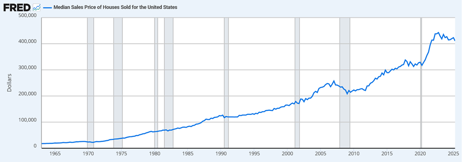
The chart shows a “bubble” in 2005 and its subsequent popping in 2007. Then, the previous trend resumes until COVID. But after COVID, something different is happening. There is a rapid increase in housing prices at a rate and to a level that is out of line with previous trends. That jump is possibly explained by the chart below, showing that housing construction is way down:
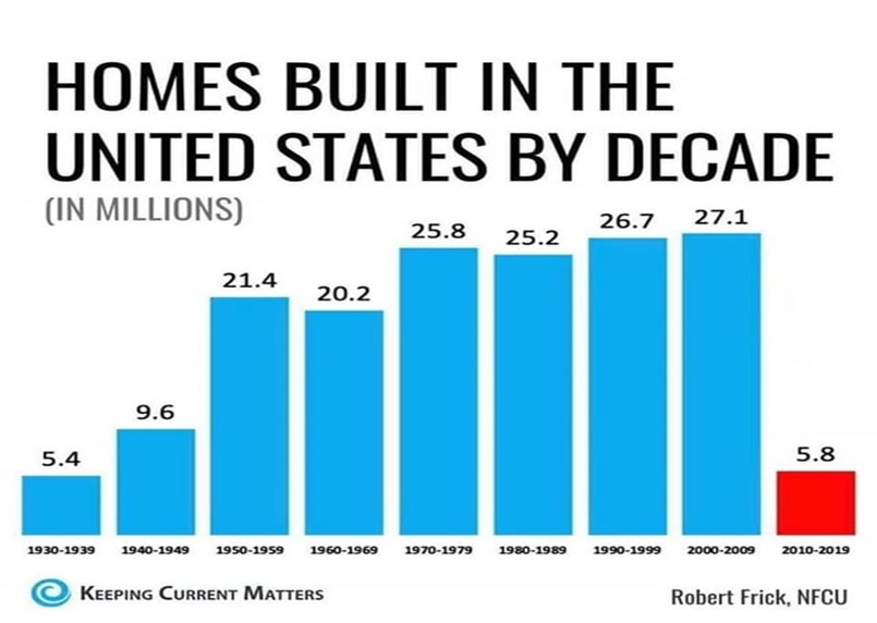
But this chart only kicks the explanation down the road. Basic economics tells us that when supply does not keep pace with demand, prices will increase. That is exactly what we are observing, but why has supply behaved this way? Some of it is tied to the wounds inflicted by the subprime mortgage crisis that started in 2007, but this is a drastic overcorrection. Early data indicates that more houses have been built between 2020-2025, but not at the historical average. There are demographic and other explanations underlying much of this issue, but they will have to wait for part two of this essay.
[1] https://www.newser.com/story/225645/average-size-of-us-homes-decade-by-decade.html
[2] https://www2.census.gov/programs-surveys/nrs/tables/time-series/historical-nrs/uspricemon.pdf
[3] https://www.statista.com/statistics/242189/disitribution-of-households-in-the-us-by-household-size/?srsltid=AfmBOorCkSOjJPK21z6aaRiehlwEvat9eF84yl1l39bZg2rUxKcq1h3z
[4] https://www.census.gov/library/publications/1971/demo/p60-80.html
[5] https://www.sparefoot.com/blog/average-square-footage-of-a-house
[6] https://worldpopulationreview.com/state-rankings/average-household-size-by-stat
[7] https://www.census.gov/library/stories/2025/09/median-household-income.html